


0
Your Cart
No items found.
Go to pricingProduct is not available in this quantity.
0
Your Cart
No items found.
Go to pricingProduct is not available in this quantity.
A challenge many teams face is data visualization — presenting complex market data in neat and clean infographics that an audience can understand. The global pharmaceutical industry generates trillions of dollars across dozens of therapeutic areas, regions, and companies, so the raw numbers alone can overwhelm a slide. In this article we take you through the steps we followed to visualize global pharmaceutical market data, slide by slide, and explain why each chart, icon, or layout was chosen.
Main points covered are cover slide, table of contents, executive summary, market size, growth drivers, key challenges, regional sales, therapeutic areas, largest companies, top selling drugs, and future outlook.
We have added the link to download global pharmaceutical market overview presentation with updated data up to June 2026 so you can re-use it in your next business review or executive presentation
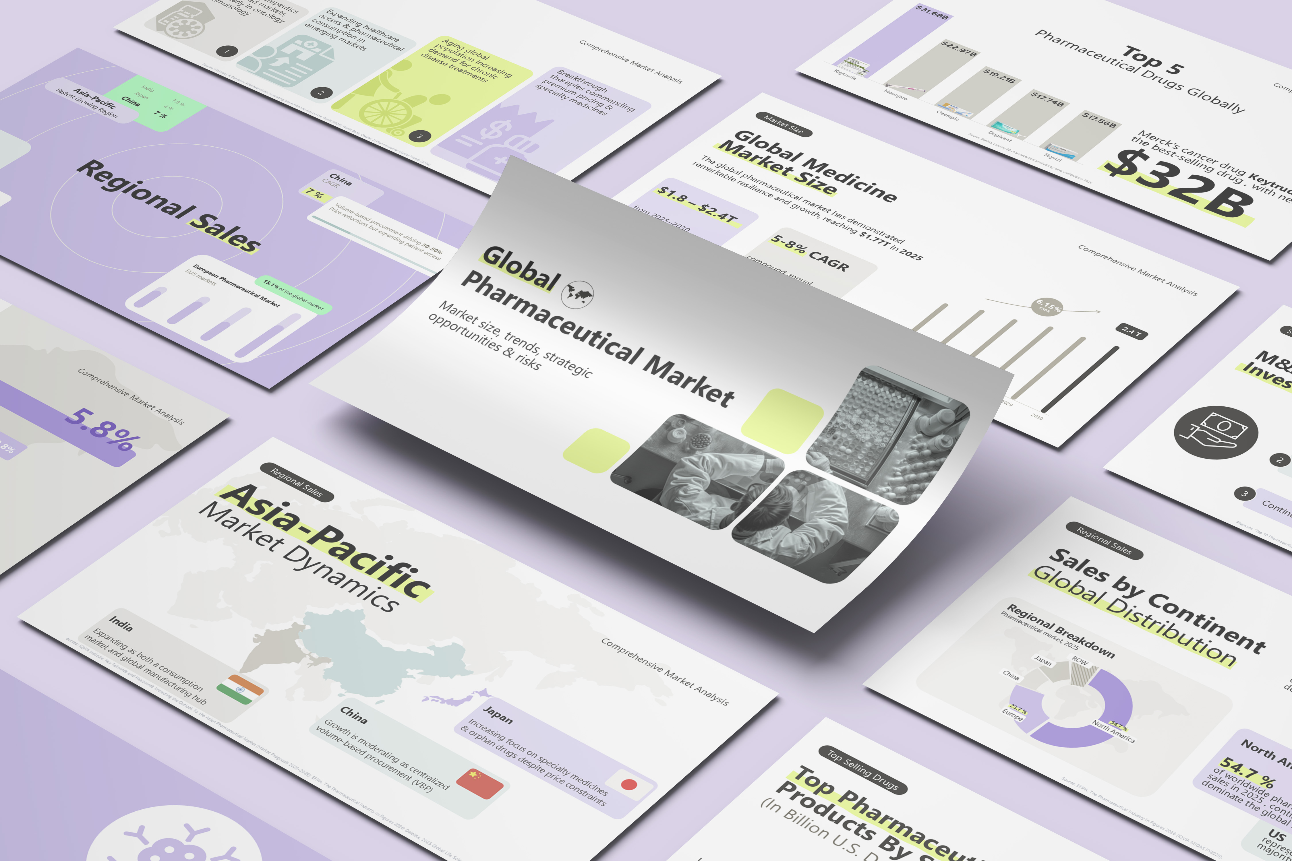
The cover slide is your opportunity to attract the audience from the first look. To represent the global pharmaceutical market, we used a grid of complementary images to present the medical theme — vials, tablets, and lab work in black and white— paired with a single lime-green accent color behind the title and a small world icon for scale.

The table of contents is important to show the audience the scope of the report before diving into the numbers. The main points included were market size, growth drivers, regional sales, therapeutic areas, largest companies, top selling drugs, and future outlook. Each topic is represented by a short one-line description under its heading, keeping the overview clean rather than cluttered with icons.
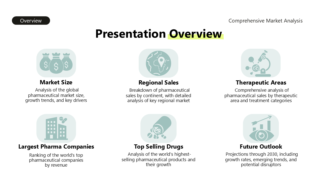
The most important 2026 take aways: the global pharmaceutical market reached approximately $1.8T in2025, growing at ~6–10% annually; growth is concentrated, with oncology, immunology, and diabetes now driving 43% of global value; and companies are responding through GLP-1 expansion, oncology investment, and M&A to offset patent losses.
We chose a three-columnlayout (Situation, Complication, Resolution), so each point stands on its ownwithout crowding the slide.
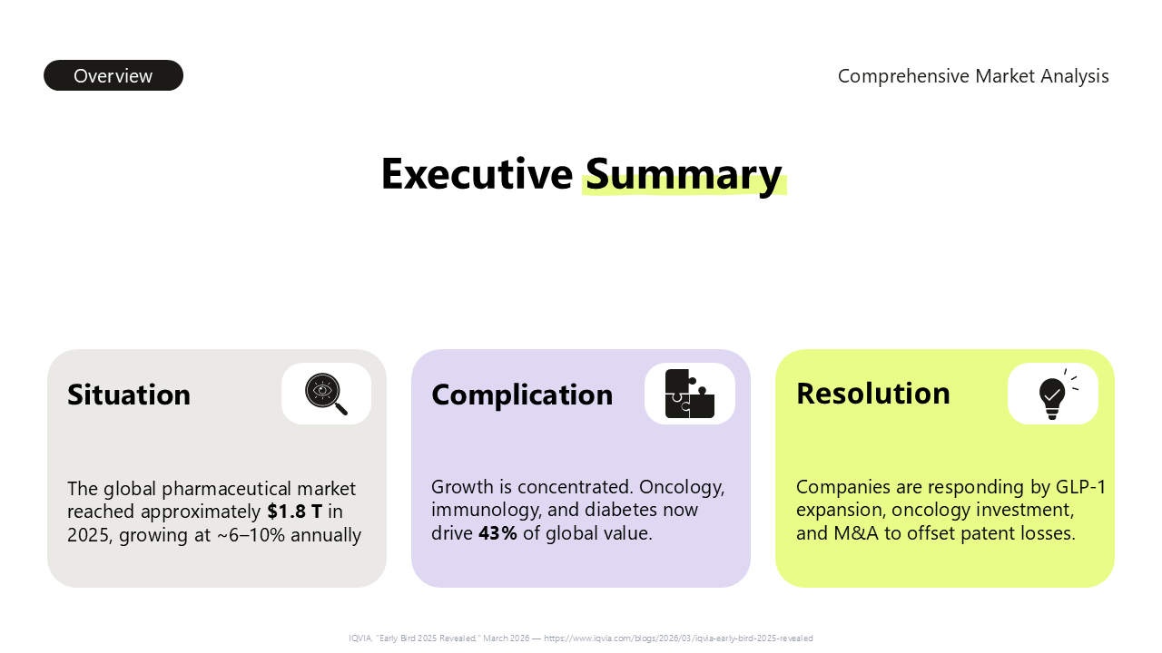
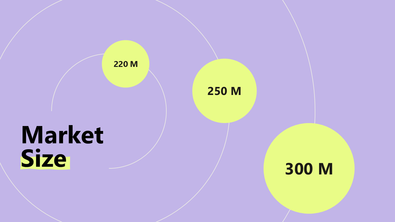
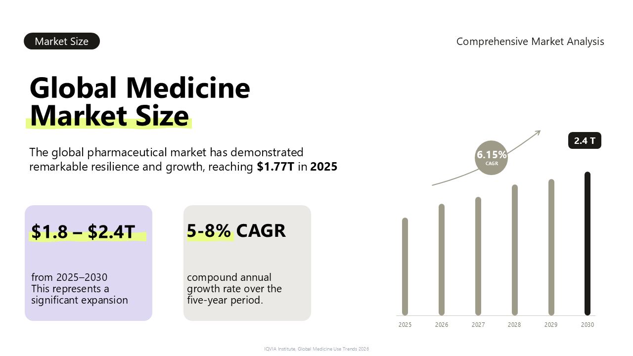
The global pharmaceutical market reached $1.77T in 2025, with expectations to grow to $2.4T by 2030 at a 6.15% CAGR.
A column chart is the best fit for growth over time. We used a theme-colored chart with emphasis on the $2.4T market size in 2030, and a supporting slide traces the historical growth trend from the 2015–2016 oncology approval wave through the 2019–2020 pandemic demand spike to the 2023–2024 GLP-1 mega-blockbuster shift.
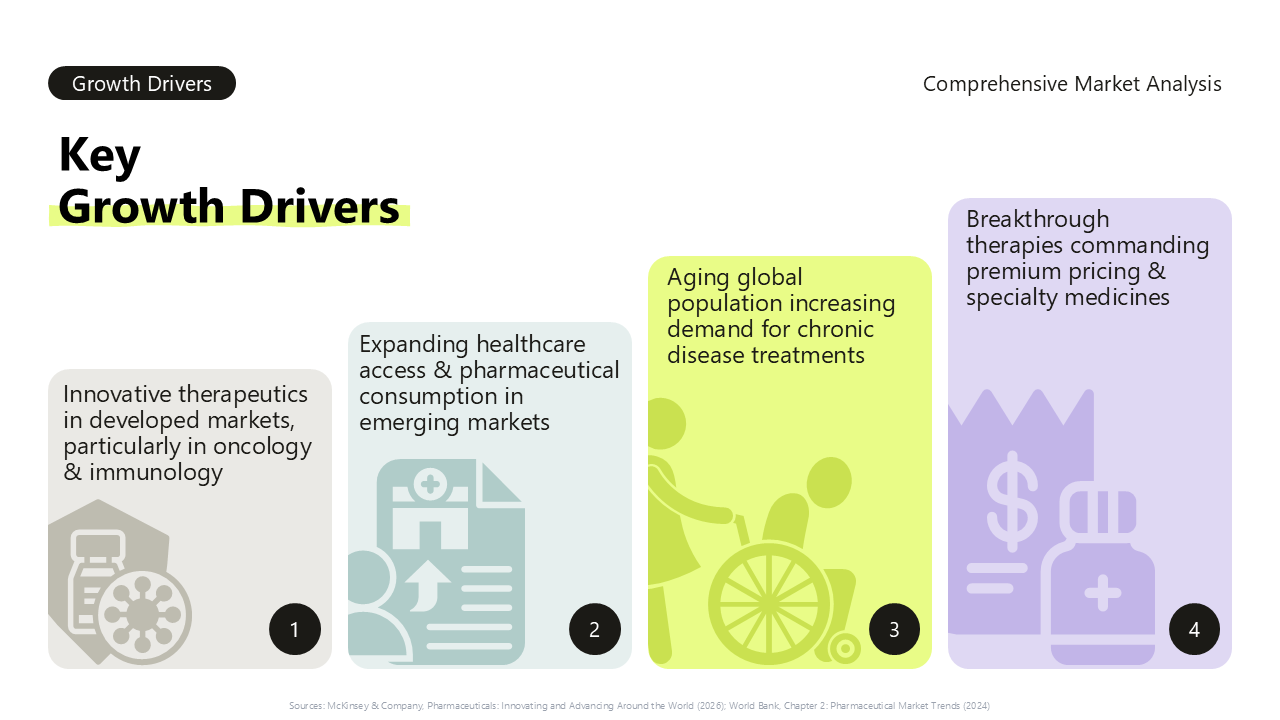
The key growth drivers were innovative therapeutics in oncology and immunology, expanding healthcareaccess in emerging markets, an aging global population, and premium pricing onspecialty medicines.
We used four short cards,each numbered 1 through 4 with its own supporting text, so the drivers read as a clear, ordered list rather than a wall of bullet points.
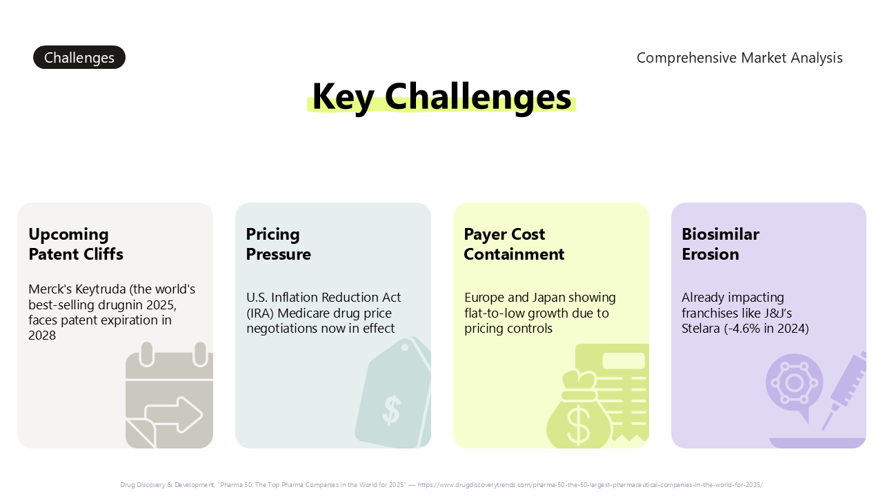
The key challenges facing the market are upcoming patent cliffs — Keytruda facing patent expiration in 2028 — pricing pressure from policies like the U.S. Inflation Reduction Act, payer cost containment in Europe and Japan, and biosimilar erosion of existing franchises, already visible in J&J’s Stelara.
Design-wise, we used aneutral, flat color palette instead of the bright lime accent, since achallenges slide should read as caution rather than opportunity.
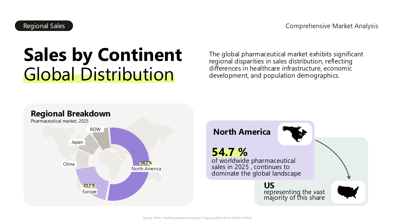
North America accounts for 54.7% of worldwide pharmaceutical sales in 2025, Europe about 23.7%, with the rest split across China, Japan, and the rest of world.
A donut chart works well here, since the story is share of a whole. We followed it with a dedicated North America slide (the U.S. alone represents ~53% of the global market), a European market breakdown by country (Germany 4.9%, France 3.1%, Italy 2.8%, UK2.5%, Spain 1.8%, with EU5 markets at 15.1% of the global total), and an Asia-Pacific slide covering China, Japan, and India as the fastest-growing region. For CAGR from 2026–2030, we used simple side-by-side cards — North America 2–5%, Europe 2–5%, China 6–8% — rather than layering growth rate onto the same donut chart, since mixing share and growth rate on one chart tends to confuse more than it clarifies.
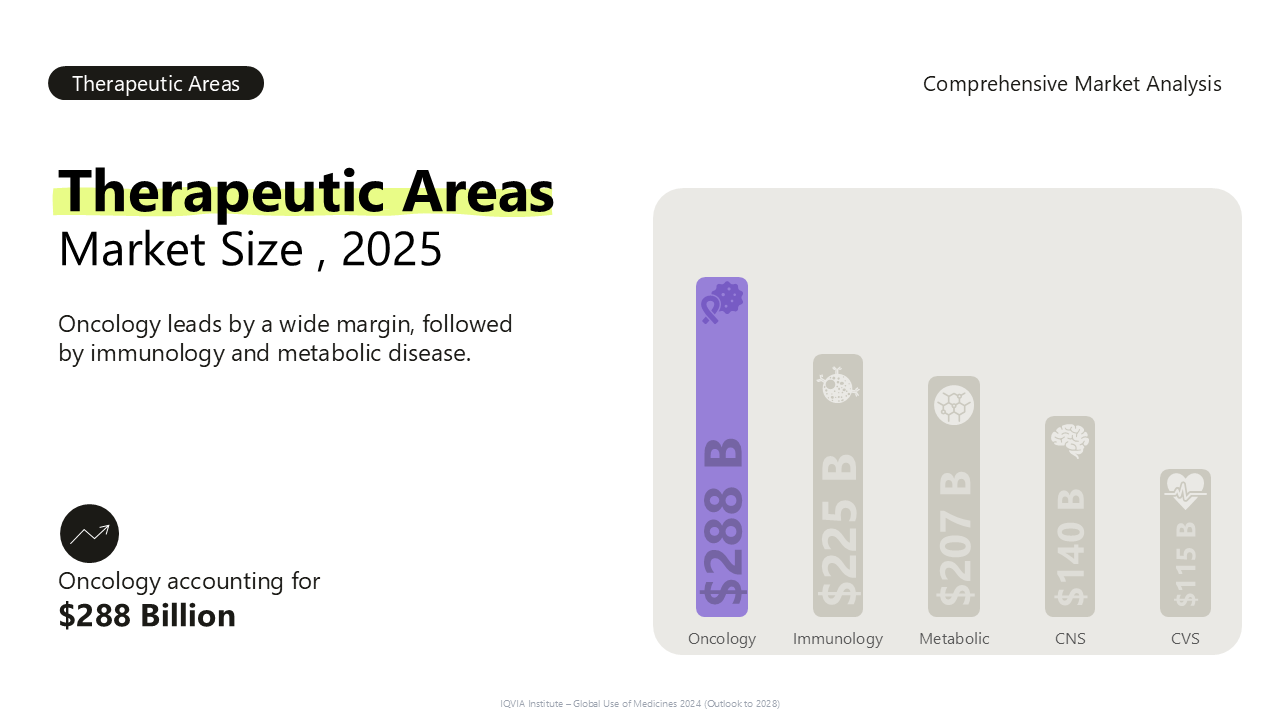
Oncology is the largest therapeutic area in 2025 at roughly $288 B, followed by immunology at $225B, and metabolic disease/diabetes at $207 B.
A horizontal bar chart ranks the therapeutic areas against each other clearly. For a deeper dive into immunology, a dedicated slide calls out the $225B global immunology market and its market leader, Dupixent, at $17.7B in 2025 sales across atopic dermatitis, asthma, and rhinosinusitis. A follow-up card layout breaks down immunology’s sub-segments — rheumatology ($36B), dermatology ($22B), and gastroenterology($18B) — since sub-segment breakdowns rarely need more than three or fourcategories.
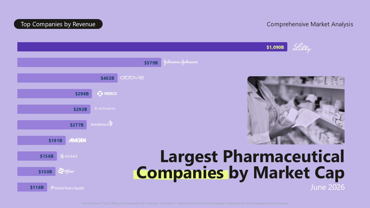
Ranked by market capitalization in 2026, Eli Lilly topped the list at roughly $1.09T, jumping from eighth to first place largely on the strength of its GLP-1franchise (Mounjaro and Zepbound), followed by Johnson & Johnson at ~$579Band AbbVie at ~$402B.
We used a long horizontal bar chart, since company rankings are one of the few slides where audiences genuinely want to compare ten or more entries at once. For atop-three callout, we used a nested circle layout instead, which communicates the scale difference between the top players more dramatically than a bar chart.
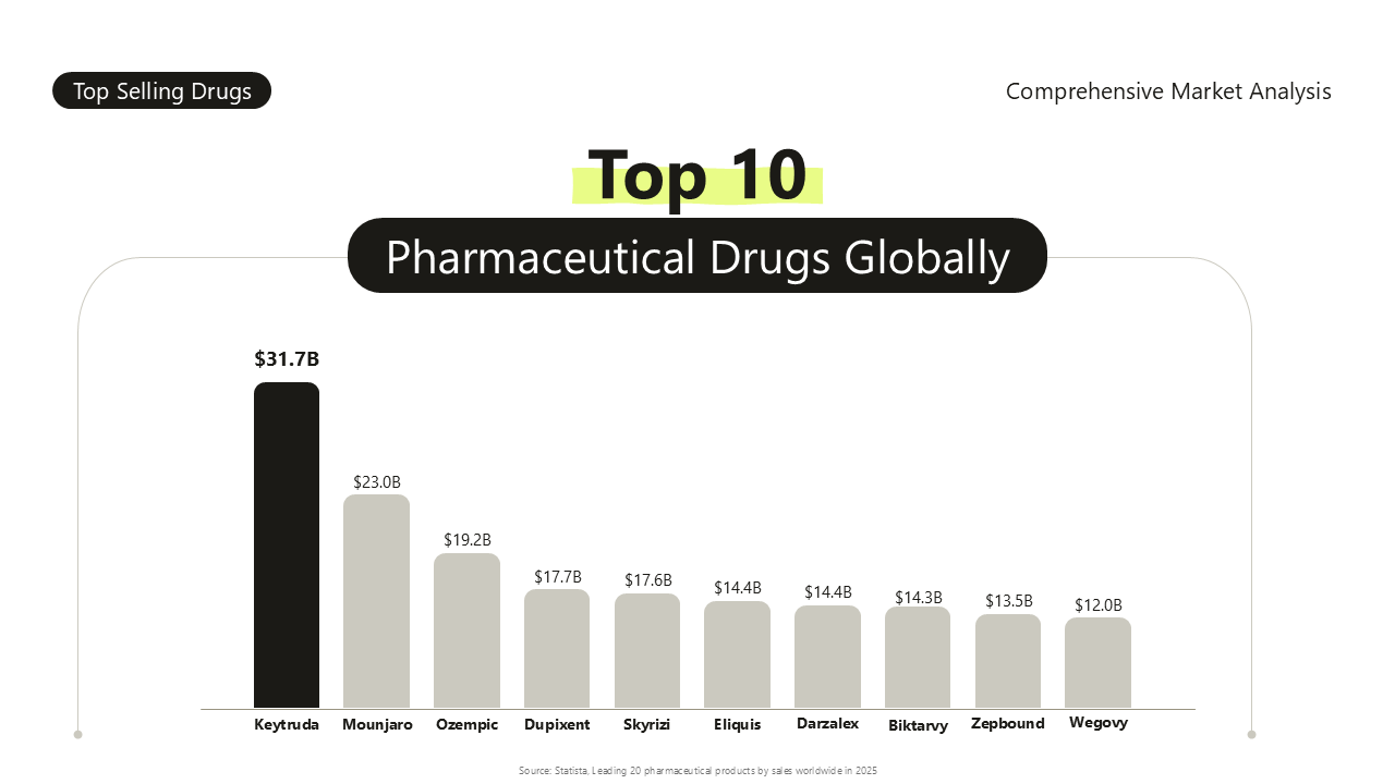
Keytruda leads global drug sales in 2025 at roughly $31.7B, followed by Mounjaro at ~$23B, Ozempic at~$19.2B, Dupixent at ~$17.7B, and Skyrizi at ~$17.6B.
A ranked bar chart with product packaging images above each bar works best here, since recognizableproduct imagery helps a non-technical audience connect a drug name to something they may have seen advertised. We also included a top-5 callout version and anested-circle-style highlight for Keytruda’s nearly $32B in sales.
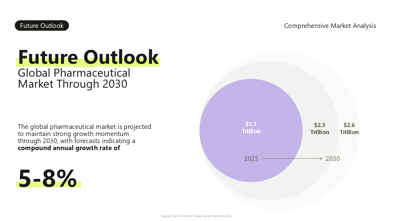
The market’s 2025 baselineis around $1.7 T, with 2030 estimates ranging from $2.3T to $2.6T depending onthe scenario — an overall 5–8% CAGR. Metabolic diseases are the fastest-growingtherapeutic category at 20–24% CAGR, ahead of novel modalities at 15–18% andoncology at 10–13%.
We used three bars — the confirmed 2025 baseline alongside a low and high 2030 estimate — so the audience gets a sense of the forecast range without needing to read a paragraphof caveats. A follow-up slide covers biosimilars specifically: Europe leads adoption at 65% average across key molecules, with $200B in biologics facing patentexpiry through 2030.
The closing themes werecontinued therapeutic innovation, evolving market access and reimbursementmodels, AI/ML-driven digital transformation across the R&D pipeline, and agrowing sustainability focus. A companion slide on next-generation biotherapeuticsnotes the cell and gene therapy market growing from $59.5B in 2025 to anexpected $111.9B by 2033.
We closed with a four-cardgrid, each with a one-line takeaway, mirroring the table of contents layoutfrom the start of the deck, so the presentation visually comes full circle.
Animation should support the story, not steal the spotlight — that’s the guiding principle behind the click-to-reveal animation used throughout this presentation. Each point appears only when the presenter clicks forward, giving them room to explain one idea fully before the next competes for the audience’s attention. This simple, purposeful pacing keeps a data-heavy pharmaceutical market presentation from feeling like a wall of information dropped on the audience all at once —instead, it unfolds the way a well-paced conversation would, one insight at a time.
The presentation can be reused in different contexts, since the colors are pulled from the slide master — it will match the style of whichever target presentation you drop it into.
We love sharing free resource with Presentile customers

